Travel Booking Site
Responsive UX Design
Challenge:
Design a responsive website where users can find and book a hotel for an upcoming trip.
Consider user needs:
● Availability during selected travel dates
● Accommodating users’ budget
● Ease of booking accommodation for upcoming travel
Design Process
Research
In my research of competitor sites including airbnb.com, booking.com, and Hotels.com I identified 3 predominant strengths to inform the aesthetics and usability of my site design.
Accessibility - allowing users to change language and currency
Visual Hierarchy - placing prominence on the key elements to allow users to seamlessly navigate, search and apply filters as needed. As well as highlighting relevant information such as map view and location details relative to city center / beach or other relevant attractions
Customization - Allowing the User to tailor their experience; create an account, highlight and save favorites to revisit, adjust search criteria for dates, number of people and rooms needed, and adjust filters to refine their search to fit within their budget and provide desired amenities
airbnb demonstrated a simplified design, which eliminates distraction and fast tracks the user experience allowing the user to easily target their search and customize their experience.
Booking.com shows a clear example, allowing users to specify their language and currency. This feature broadens the accessibility of the site for individuals from all over the world.
Hotels.com allows users to refine their search with an informed understanding of the location of their hotel options by including a map view and search specific filters.
Identify Target Users and Their Needs
I designed a site for families and individuals seeking a more all inclusive travel / accommodation experience. In order to provide the user with an overall warm and inviting experience, throughout my design process I focused on:
Visual Hierarchy
Ease of navigation:
Intuiting user needs with travel suggestions and targeted filters
Soft colors and imagery to provide a more pleasant overall experience.
Wireframing
I mapped out wireframes of the 5 pages I believed would best demonstrate the users experience navigating this site.
These wireframes include:
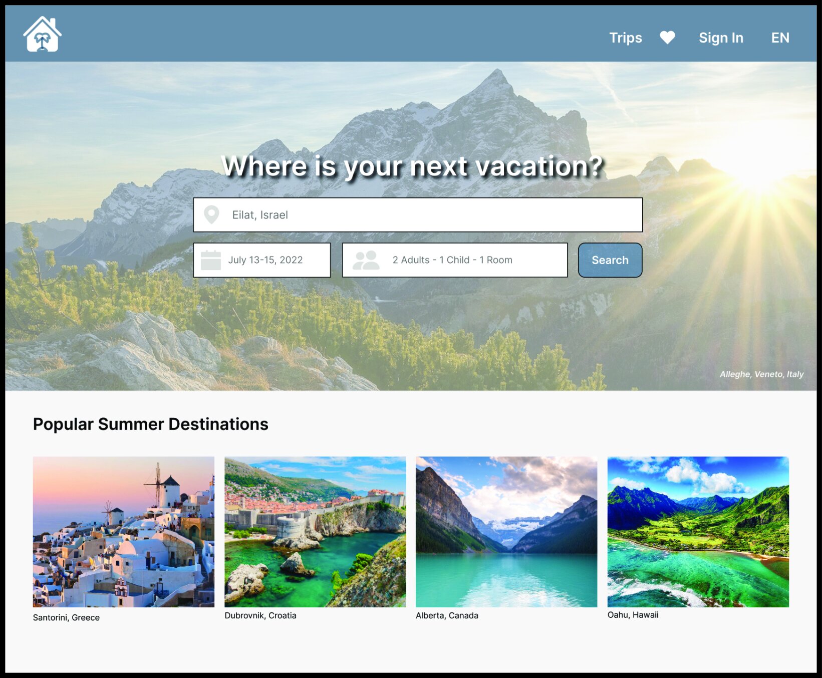
Home Page
Booking Options
Booking Selection
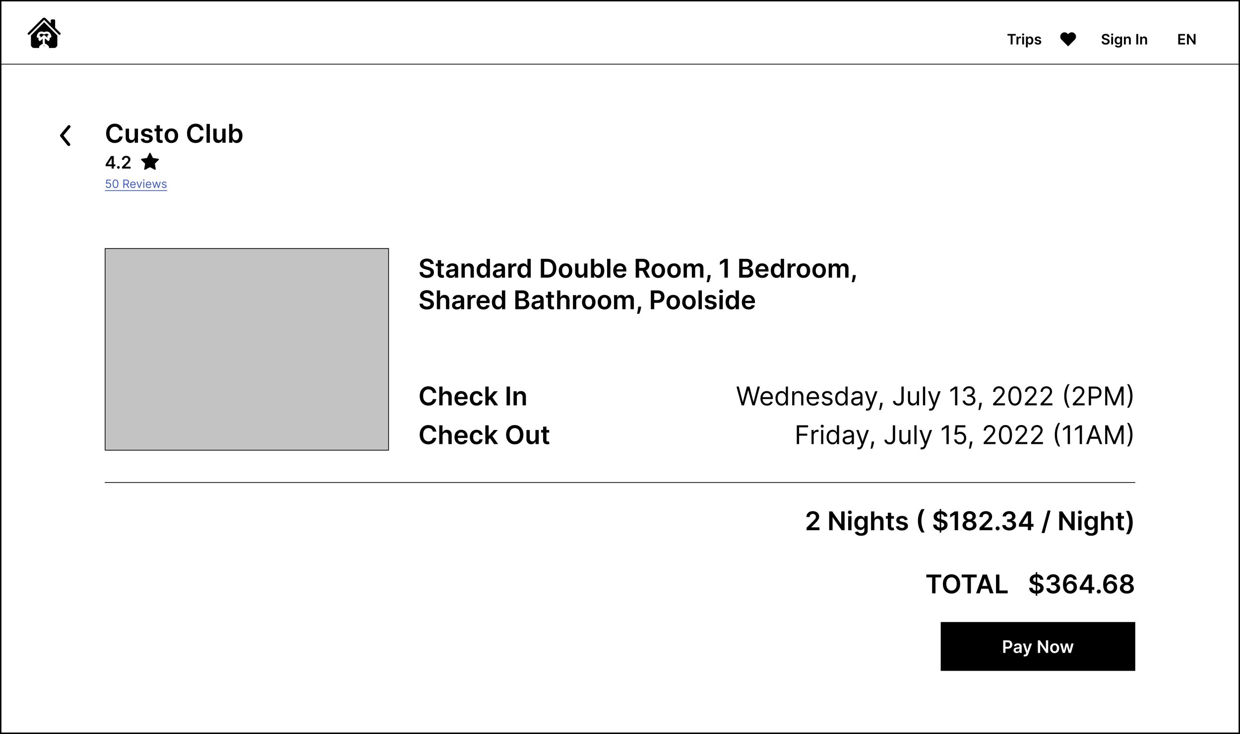
Booking Reservation
Account
High Fidelity Site Design
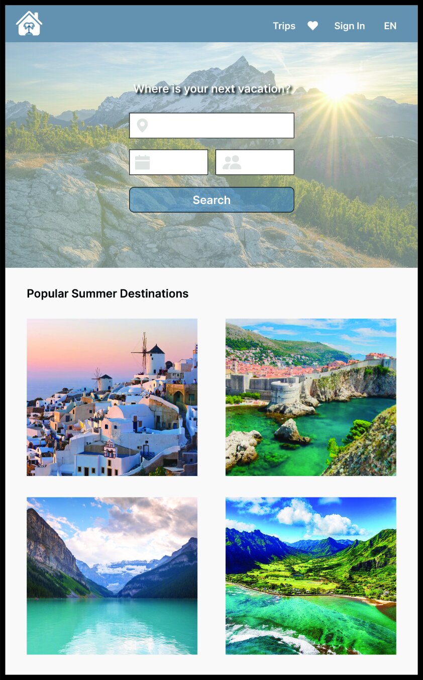
From my initial wireframe designs I finessed the layout and information, added color and images. To ensure the responsive design of my site I adjusted my layout to accommodate various window sizes, making sure that all key components remained clear and accessible for the user (see home page example ).
Applying soothing colors and imagery to enhance the user experience my goal was to make the process of booking a hotel pleasant and simple, start to finish.
Completed Site Design
My site features 5 pages through which users can book accommodation for their upcoming travel.
Once inputting initial search criteria on the home page the user is directed to the booking page where they can refine their search, apply filters and view all available accommodation that meets their criteria.
Once their preferred hotel has been selected, a new page will open allowing them to view specific room availability.
Here, the user user can review their reservation, details of the room booked, the dates of their stay, check in and check out times and total cost before confirming their booking.
Additionally I have created an account page, accessed via the navigation bar, allowing users to update their account information, payment methods, review their bookings and adjust preferences for security and notifications.
Prototyping
To demonstrate the flow of this site I incorporated prototype buttons. In addition to ensuring smooth navigation between pages, I created drop down menus to allow the user to adjust their search criteria and apply relevant filters. These examples demonstrate the usability of this site and reflect the process through which one would complete their hotel booking.
Here users can input their desired travel dates via drop down menu.
To accommodate specific needs this drop down menu allows the user to filter for number of travelers and rooms needed.
Adjusting for mobile devices and smaller windows, I reduced my filter options to a drop down menu and adjusted a hover feature to highlight the locations of images featured as suggested travel destinations.


